Horizontal Scroll Like Lenis: Rebuild It With Motion
How do you make cards slide sideways as you scroll down? The Lenis horizontal scroll rebuilt with Motion and sticky, accessible, with a ready prompt.
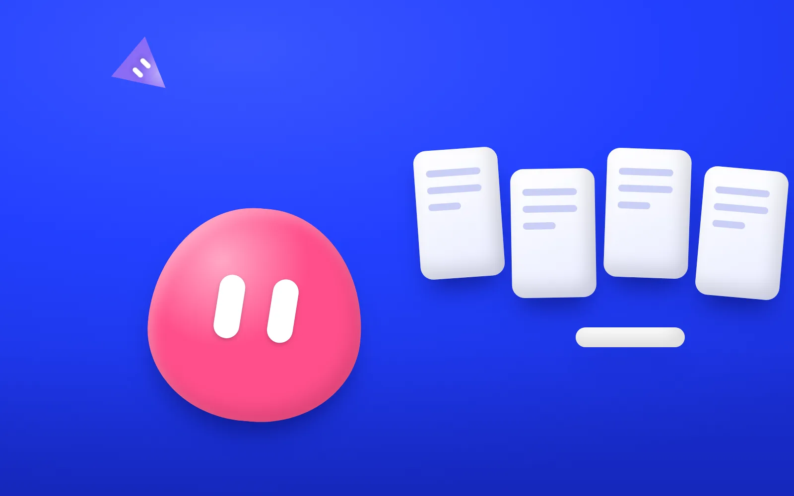

You scroll down and, instead of moving down, a row of cards slides sideways: that's the horizontal scroll on the Lenis website. To rebuild it you need a very tall section, a box that stays pinned to the screen and a few lines of Motion. Below: how it works, a prompt to have an AI agent build it, and the checks that keep it working for keyboards, phones and people who turn animations off.
What It Is
It's a scroll-linked effect: the movement depends on where you are on the page, not on a timer. Scroll a little, the row moves a little. Stop, and it stops. The section pins to the screen, your vertical scroll turns into sideways motion and, once the row runs out, the page carries on down.
Lenis is a free, open-source smooth-scroll library (the page glides with the mouse wheel instead of jumping) made by the studio darkroom.engineering. Its home page is a lesson in scrolling: a giant pink wordmark, then the headline "Why smooth scroll?" pinned on the left while short blocks of text scroll on the right, then the "Lenis runs the web" section. That's the one we rebuild.

Each card shows a site that uses Lenis, with its name and the studio behind it, like "Lando Norris" by OFF+BRAND or "Grand Theft Auto VI" by Rockstar Games. In our test recording, in a window 1,440 pixels wide, about 300 pixels of scroll moved the row about 205 pixels sideways. In a phone-size window, the same cards were simply a vertical list. From the page's styles, the pinned part seems to use position: sticky, a CSS setting that holds a box in place while its section scrolls. We don't know how the rest is built, and we won't guess.

Why It Helps
A long list of things to show turns into a wall on screen. This effect turns it into a small show, for four reasons:
- It follows your hand. Nothing starts by itself: you set the speed and can stop halfway. Motion that answers to you feels calm; motion on its own timer feels like showing off.
- One thing at a time. While the row slides, it's the only thing asking for attention. Pin first, then move.
- The change of direction means something. Sideways motion says: this is a collection, browse it. Like running a finger along books on a shelf.
- It knows when to step aside. On a phone it drops the trick and shows a plain list, easier with a thumb.
It fits anywhere you have a short set of things worth browsing: the rooms of a guesthouse, a seasonal menu, an architect's projects, a new collection in an online shop.
How to Do It
Our demo, made for this article, is one HTML, one CSS and one JavaScript file, with Motion loaded from a CDN (a public server that hosts libraries, so there's nothing to install). Motion is an animation library that works with React, Vue or plain JavaScript.
- A tall section with a sticky box inside. The section is much taller than the screen: that extra height is the runway for the sideways movement. Inside, a box stays pinned while you scroll along the runway. In the demo the section has a label for screen readers, "Six small lessons", and holds a heading and a list of six links, one per card: Spacing, Type, Color, Motion, Focus and Mobile.
- A plain row first. By default the row of cards (called the track in the demo) is a horizontal row you swipe, with scroll snap, a CSS feature that makes each card stop neatly at the edge. If the script never runs, readers still get a row that works.
- Then the trick, only when needed. The script adds the is-linked class to the section. In that mode the section takes a height stored in a CSS variable, the inner box becomes sticky, as tall as the screen (100vh) and hides what spills over, and the track becomes as wide as all its cards in a row.
- Measure the trip. The script works out how far the track must travel: track width minus screen width. Then it makes the section taller than the screen by exactly that amount. One pixel of scroll moves the track one pixel sideways.
- Link the track to the scroll. A sideways animation made with Motion's animate(), handed to scroll(), which drives it by scroll position instead of time. With offset "start start" and "end end" it starts when the top of the section hits the top of the screen and ends when the bottom hits the bottom. Ease linear keeps the speed even.
- Turn it on only when it makes sense. The script checks that the screen is at least 768 pixels wide and that reduced motion is off. If either fails, the plain row from step 2 stays. It recalculates when the window resizes or the setting changes.
- Fix the keyboard. The track only moves visually, with a CSS transform, so pressing Tab can land focus on a card far off screen. A small focusin listener scrolls the page until the focused card is visible, and a 4-pixel focus ring always shows where you are.
Ready to copy, for an AI coding agent:
Build a section where vertical scrolling slides a row of cards sideways, in one HTML, one CSS and one JavaScript file. Use Motion loaded from a CDN, plain JavaScript version. Content: a section with the accessible label "[section name]", a heading and a list of [6] links, one per card: [card title 1], [card title 2], [...]. Behavior: 1. Base, no script: the row of cards is a horizontal row you swipe, with scroll snap. 2. The script adds the class is-linked to the section only if the screen is at least 768 pixels wide and prefers-reduced-motion is off. Otherwise the base row stays. 3. In is-linked mode: an inner box, sticky at the top, 100vh tall, overflow hidden; the track as wide as all its cards. 4. Measure the distance: track width minus screen width. Make the section taller than the screen by exactly that distance, through a CSS variable. 5. Animate the track sideways with animate() and link it to scroll() with offset ["start start", "end end"] and ease linear. 6. Recalculate everything when the window resizes or the reduced motion setting changes. 7. Accessibility: on focusin, if a card gets focus, scroll the page until that card is visible. A 4-pixel focus ring. Don't hide off-screen cards with aria-hidden or display: none. When you're done, tell me what you couldn't test in a browser.
If you work in React, ask for the same effect with Motion's useScroll and useTransform hooks. And you don't need Lenis for this: the demo uses the browser's normal scroll. Lenis adds the gliding feel on top, if you want it.
Quick Test
Ten minutes, five checks:
- Scroll, then stop. The row should stop when you stop. If it keeps going, it isn't linked to the scroll.
- Reach the end. The last card should reach the edge just as the page starts moving down again. If the page moves on early or stays stuck after, the runway isn't as long as the trip.
- Keyboard only. Press Tab a few times: every focused card should come on screen, with a clear ring.
- Narrow window. Below 768 pixels you should get the plain swipeable row.
- Reduced motion. Turn it on in your settings and reload: no pinning, just the plain row.


Watch Out For
- Off-screen focus is the hidden bug. Without the focusin listener, keyboard users land on a link they can't see.
- Don't hide cards from screen readers. They're only off screen for the eyes: the transform moves pixels, not content. Keep a real list of real links.
- Phones. A sideways gallery driven by vertical scroll is hard to control with a thumb. There, the plain row wins, as it does on Lenis.
- Use it once. It should be the only big scroll effect on the page, or it stops being a surprise.
- CSS-only scroll animations. Newer browsers can link animations to scroll with CSS alone, and according to Motion's docs scroll() uses that feature when it can. Check the Motion documentation before you rely on it.
Next step: take a short set from your own site, like projects, rooms or products, and try the prompt on a test page. For a simpler first effect, see the endless text strip in CSS. To understand who does this kind of work between design and code, read what a design engineer is.
This pill is adapted from a breakdown Alek published on Medium. Thanks to darkroom.engineering for making Lenis open source and for a home page worth studying.
In short: A good horizontal scroll follows the reader's hand, uses a runway exactly as long as the trip, and steps aside for reduced motion, keyboards and phones.
Newsletter
AI that actually works, in your inbox.
New pills, the tools we use and what we learn on real projects. Few emails, only when there is something useful.